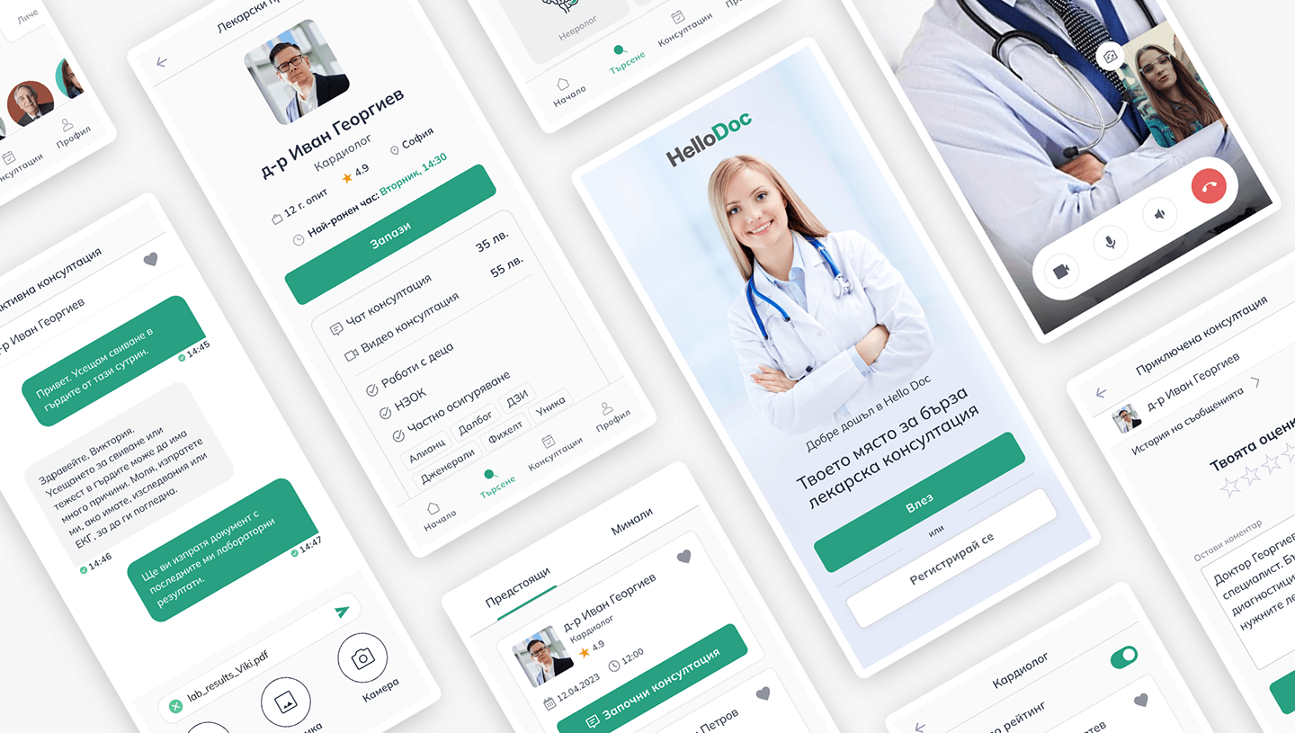
Introduction
This conceptual project was part of my Telerik Academy UX/UI Upskill course which I took in Sep - Dec '22. Our team created a mobile and a web version of the platform, however this case study shows only the mobile version as it was my primary focus.
- Timeline: 3 months
- Team: 5 individuals
- My focus: Mobile
- Responsibilities: Research, IA, Lo-fi, Hi-fi
Project Overview
Client:
Bulgarian Ministry of Health
Brief:
In pandemic times, the need for receiving and providing health care services from a distance is even more obvious. We’d like to create a platform that connects patients with doctors remotely and enables remote communication between them, so that patients can receive diagnosis and treatment, and doctors – to provide it in an easy and effective way.
Primary Research
In order to reassess the brief and work towards outlining a problem statement, we performed two rounds of research in the forms of surveys, user interviews and a competitors analysis. This also helped us defining our personas.
Identifying the user needs
We started with an initial survey (n=70) in order to understand the user needs - what would they look for in such a platform and how would they use it, and have they used similar platforms before. This gave us a starting point to drill down in the next rounds of research.
01
Quick and safe communication with doctors
02
Additional information about doctors - bio, ratings
03
Option for payment via public and private health funds
04
Easier access to highly recommended specialists
Secondary Research
We conducted a second round of research. It helped us define the foundations of the platform and to go more in-depth regarding its potential functionalities and narrow down the use cases.
User Research
The research into users' preferences and profiles resulted in a clear picture about the ecosystem of the platform and gave us a better idea into the feature list and personas.
Prefer a mobile app instead of browser-based website
Prefer Android
Identified doctor search by rating as important
Want synchronization with a health device (such as smart watch)
Based on the user research, we concluded that the platform will be created for two environments - an Android application and a web-based browser version, in order to maximise the number of possible entry points and the ease of access. Note: this case study focuses only on the mobile app, as it was my focus during the course. Due to time constraints, we worked only on the patient-side of the platform, and not the doctor side.
The users pointed out these as the most important features:
Emergency consultation
Filtering by category
Sorting
by ratingMedical
historyDigital
sick leave
Additional Insights
- Preferred type of consultation - chat
- Some users complained that other similar platforms contain little to no information about the doctors - so we need well-structured and informative doctor cards and pages
- The inconvenience of filling every time a payment method - repository in patient’s profile with their preferred payment methods
- Emergency consultation importance - minimalistic and intuitive interface so that main features are noticed
Personas
Health services are popular among almost all demographics, making the target group fairly large. In a brainstorming session we identified a proto-persona, which we subsequently amended and validated as a result of the research. In the end, we defined two personas that would be our main users.
Traits
- Tech-savvy
- Used to online collaboration
- Outdoor type of person
- Only uses apps that provide him benefits and save time
- Works out and is mindful of his health
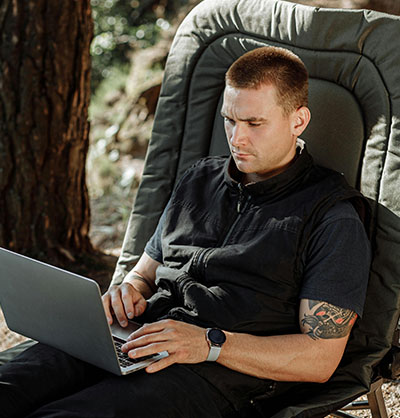
Martin
34 years old IT specialist Works remotely Not married No children
Martin is a young person with a busy schedule. His day starts early in the morning when he goes to the gym, then works from his home and his evenings usually involve walking his dog and seeing friends.
He is tech-savvy and wants to utilize all the advantages of modern technology. He likes to use utility and service applications - health apps to track his fitness level, grocery delivery apps and is used to the Google ecosystem.
A few years ago he was diagnosed with a chronic medical condition that requires him to have periodic examinations by a doctor several times a year. He uses his company-provided private health fund to pay for this.
He is tired of going to the doctor in person as it is too much hassle. He wants to stop wasting time with this and would prefer to have a remote check-up with a doctor by a video call where he can discuss his condition and possibly send photos and blood tests for further examinations.
Key Goals and Pain Points
- I want to book an online consultation.
- I want to use my medical insurance company as payment method.
- I want to make additional lab tests and share them with my doctor on a follow up conversation.
- Commuting to the doctor takes a lot of time.
- Often doctors don't keep their schedule and I need to wait.
- I don't have time to visit the doctor's office.
Traits
- Not tech-savvy
- Uses mobile devices for communication
- Is cautious on the internet
- Prefers simple solutions that just work
- Extroverted
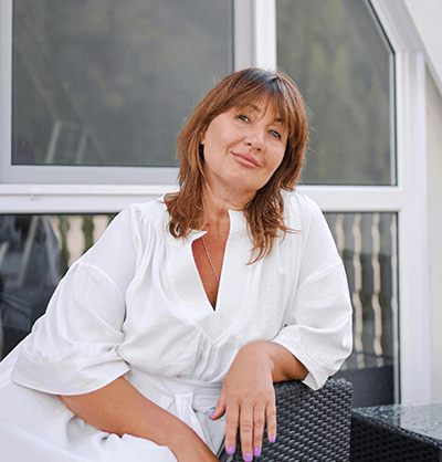
Viktoria
55 years old Bank clerk Married Has two grandchildren
Viktoria works as a bank clerk with normal 9-5 hours. In her job she is used to talking and meeting a lot of new people. She is an extroverted person, has analytical qualities and is relatively well organized.
Even though she is not tech-savvy, she tries to keep up with the times and uses her mobile phone for talking and social media. It takes her more time to learn new tech, but she is persistent.
Viktoria visits the doctor several times a year - usually for regular check-ups or when she has concerns for her health. However, she finds it hard to always find the best specialist - she is sometimes dissatisfied with the quality of the doctor and doesn't trust her GP or friends' recommendations anymore.
She wants to have access to a list of specialists depending on her health concerns and check their ratings in order to find the best one. Viktoria isn't always able to leave work in order to go to the doctor, so having the option to chat with a specialist would be realy helpful for her situation.
Key Goals and Pain Points
- I want to book a chat consultation.
- I want to find a well-rated doctor with the selected specialty.
- I want to know how much the consultation will cost me and if I can use my national health fund,
- I'm worried I won't be able to easily find an available specialist if I go to a clinic or a hospital
- Not many private clinics with the best specialists accept payment by the national health fund
- If I go to the hospital for a doctor’s appointment, I’m not sure how good the doctor really is
Problem Statement
Patients often face long waiting times when trying to book consultations through traditional healthcare systems, which can delay necessary medical attention. At the same time, finding the best possible specialist for their condition is challenging, as patients have limited access to information about a doctor's expertise, reviews, and availability. This often results in patients settling for less optimal care or facing additional delays.
A telemedicine app can address these issues by offering more immediate access to consultations, allowing patients to quickly connect with healthcare professionals. Additionally, the app’s ability to sort and filter doctors by specialty, ratings, and expertise helps patients identify the most suitable specialist, ensuring they receive the best possible care.
User Stories and Flows
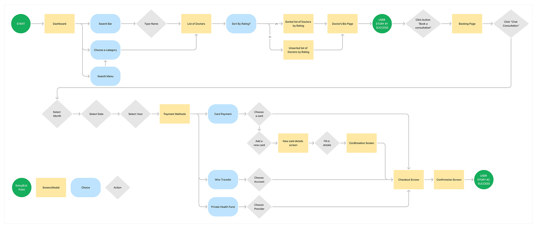
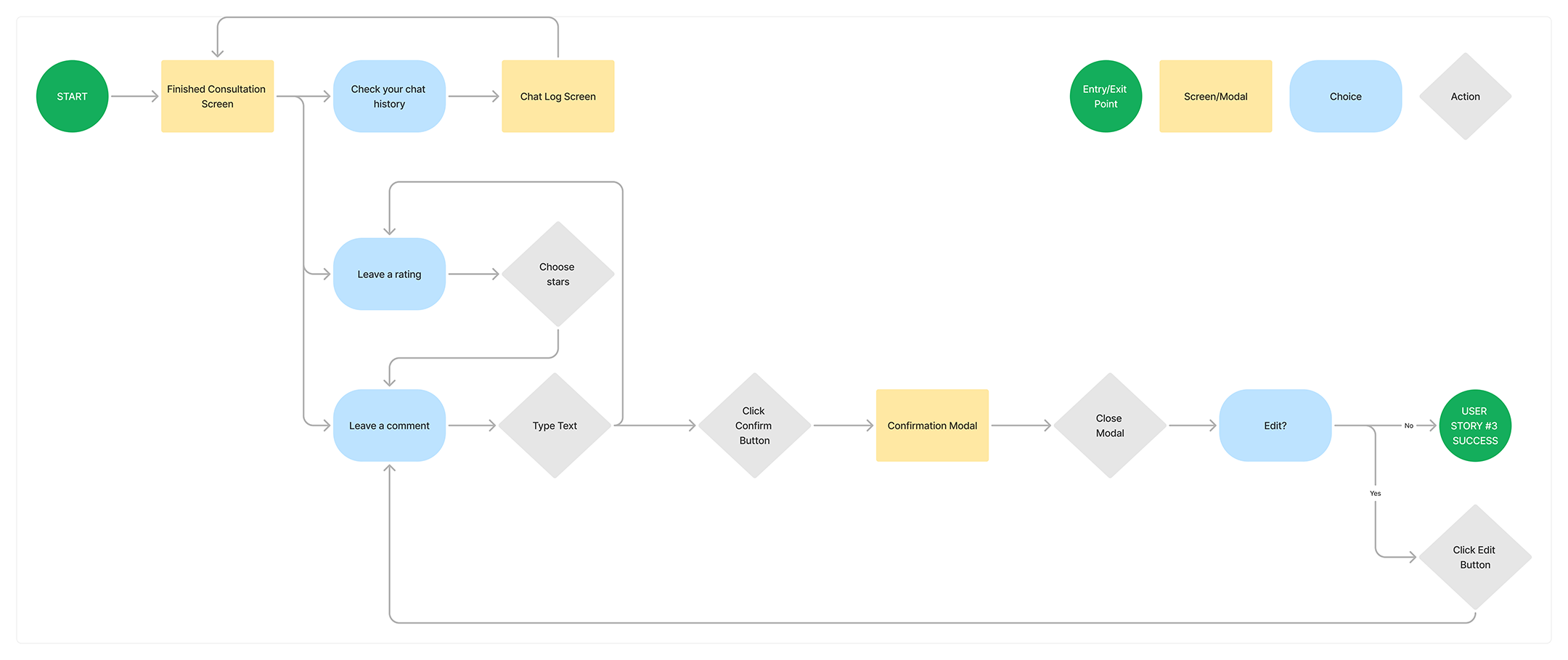
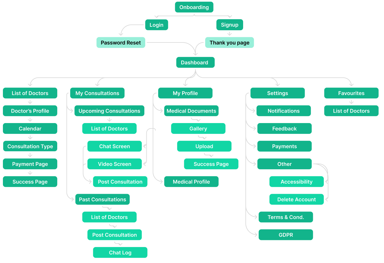
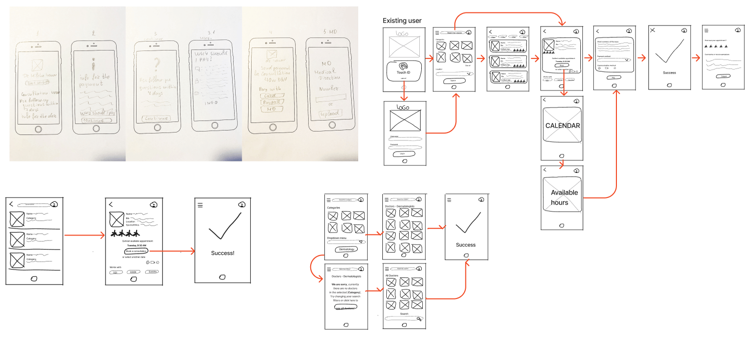
User stories in combination with user and task flows were created in order to give us more insight into the potential feature list and the informational architecture.
User Stories
As a patient,
I want to take a look at a selected specialist's profile,
so that I can decide whether to book a consultation with him
As a patient,
I want to book a chat consultation,
so that I can get in touch with a specialist about my health concern
As a patient,
I want to rate the doctor after the consultation,
so that I can contribute to the common knowledge about them
User Flows
Feature Prioritization
Based on the gathered data so far, we had enough information to outline the MVP and the roadmap of implementation of the features in the next stages.
Do now
- Video / Voice call consultation
- Chat consultation
- Emergency consultation
- Doctor’s profile
- Doctor’s rating
- Booking calendar
- Consultations list
- Consultation history
- Payment methods via НЗОК, Private Insurers, Third-party providers, Credit/Debit card
- Medical documents
- User’s medical information
- User profile
- Social media login
Do next
- Medical history
- Digital prescriptions
- Digital sick leave form
- Smartwatch data integration
- Customer support and complaint handling after consultation
Do later
- Help page
- Interactive guide
- Accessibility
- Invite your doctor (referral)
Don't do
- Vaccination log
- Family profiles
- Book a secondary online consultation
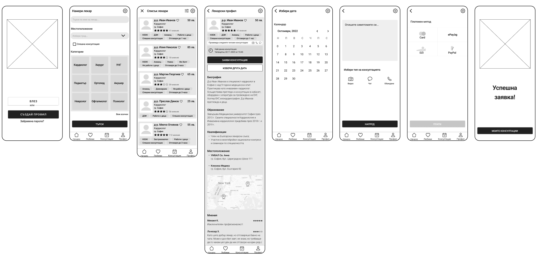
Low Fidelity Prototypes
Paper prototypes and wireframes were created with the goal to build the design foundation of the platform. A few rounds of user testing were performed which gave us an idea on possible improvements of the usability.
User Testing
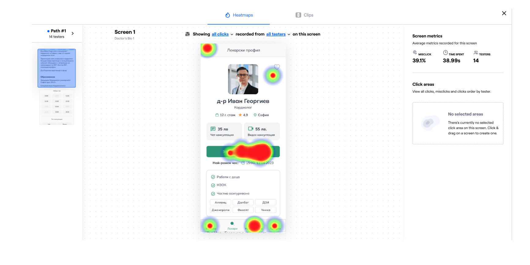
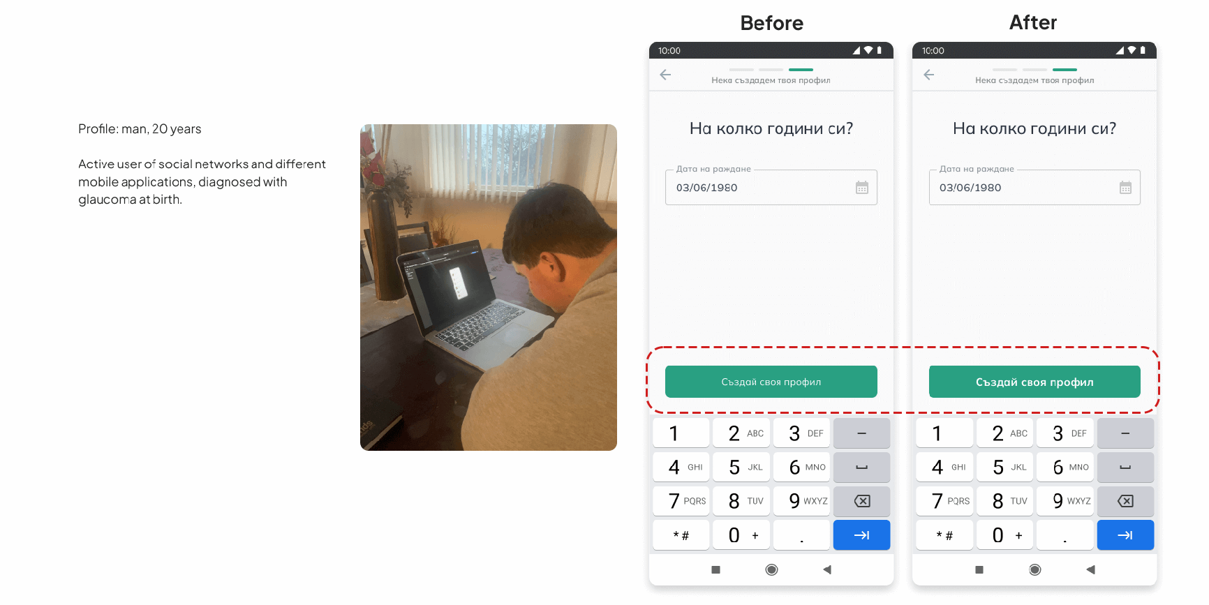
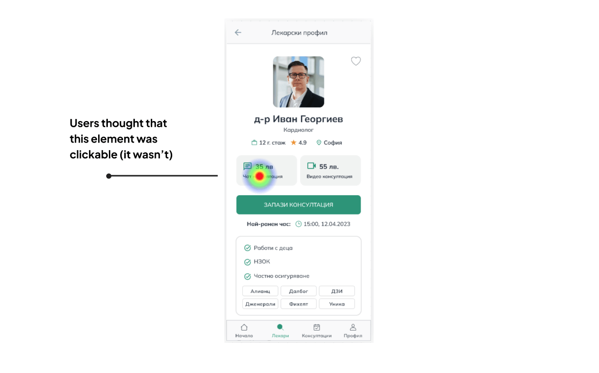
We performed a few user tests of the wireframes with a few simple scenarios following the user stories. The testers were generally happy with the experience, but they pointed out some issues that we subsequently fixed.
Avg. time to complete: 129 sec.
Success rate
Avg. misclick rate
Avg. time to complete: 178 sec.
Success rate
Avg. misclick rate
Avg. time to complete: 71 sec.
Success rate
Avg. misclick rate
Improvements
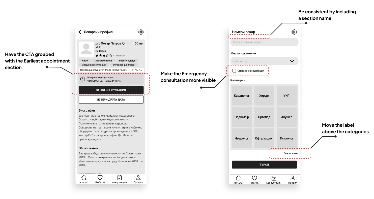
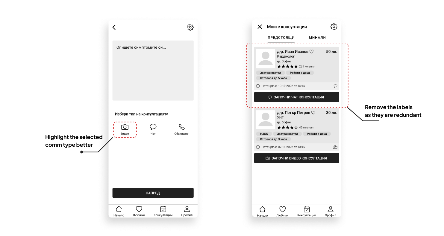
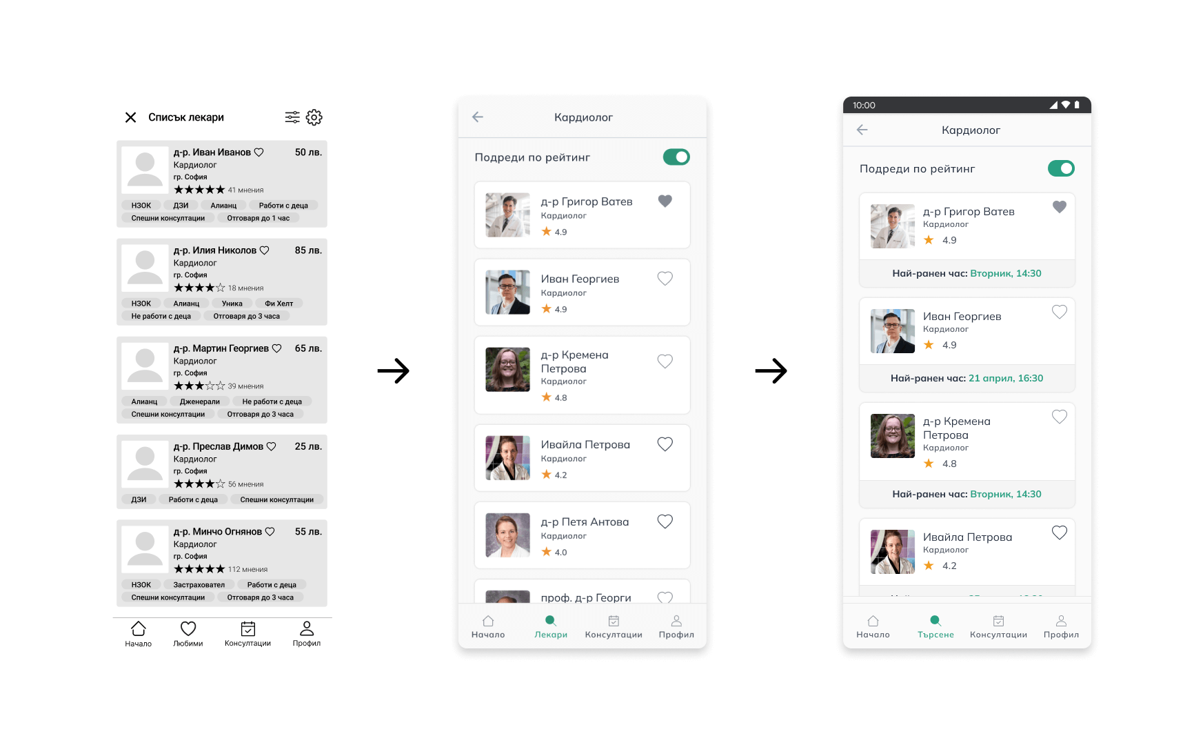
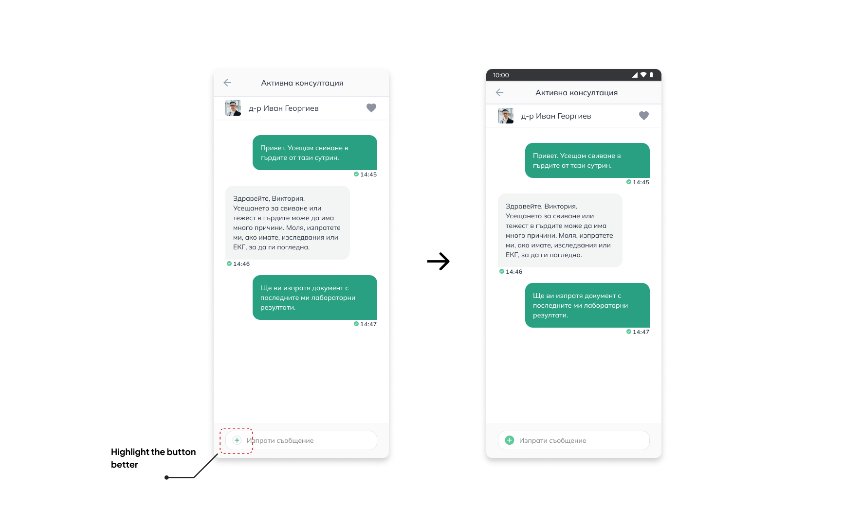
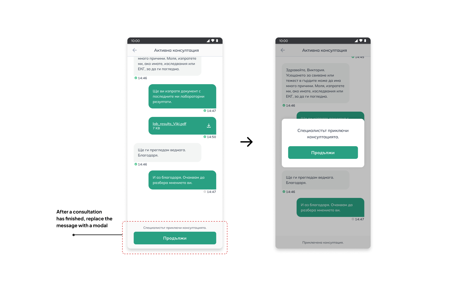
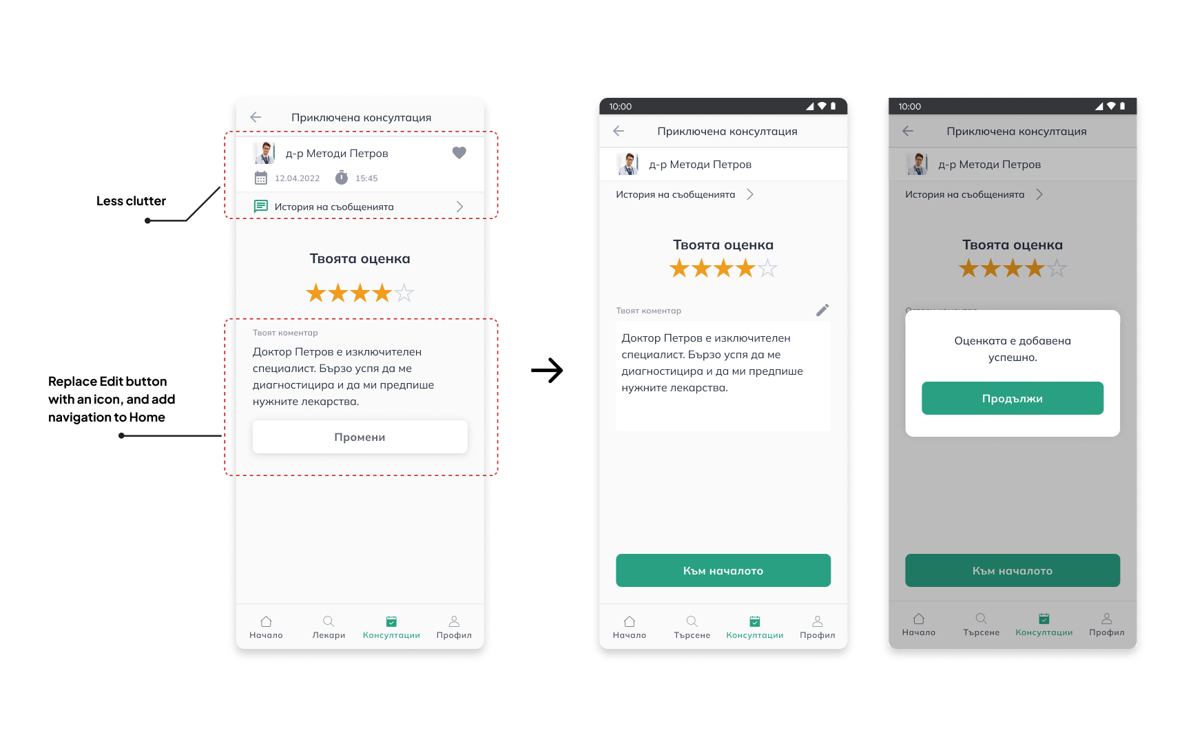
A list of potential improvements was created based on the testing. Many of them were related to not having clear visibility of certain functions. Below are a few examples.
High Fidelity Prototypes
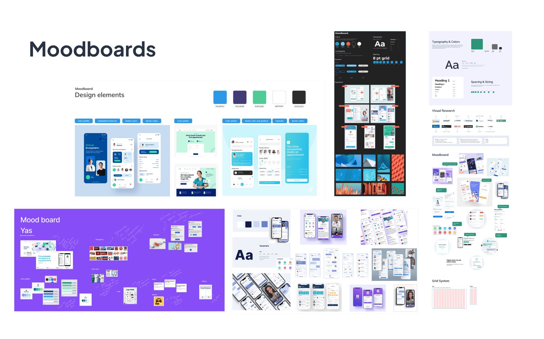
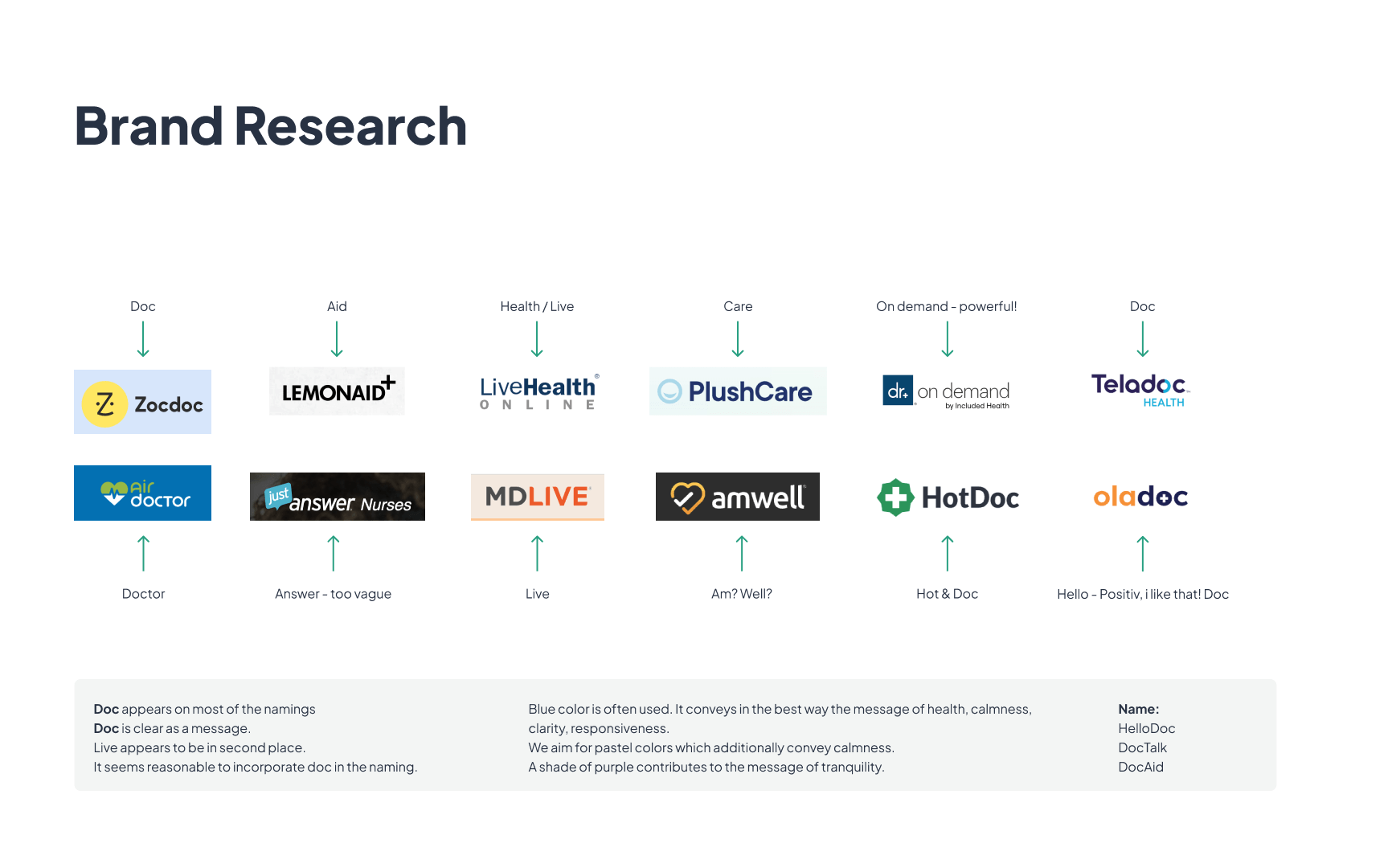
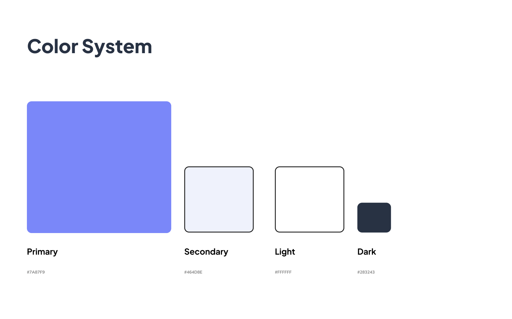
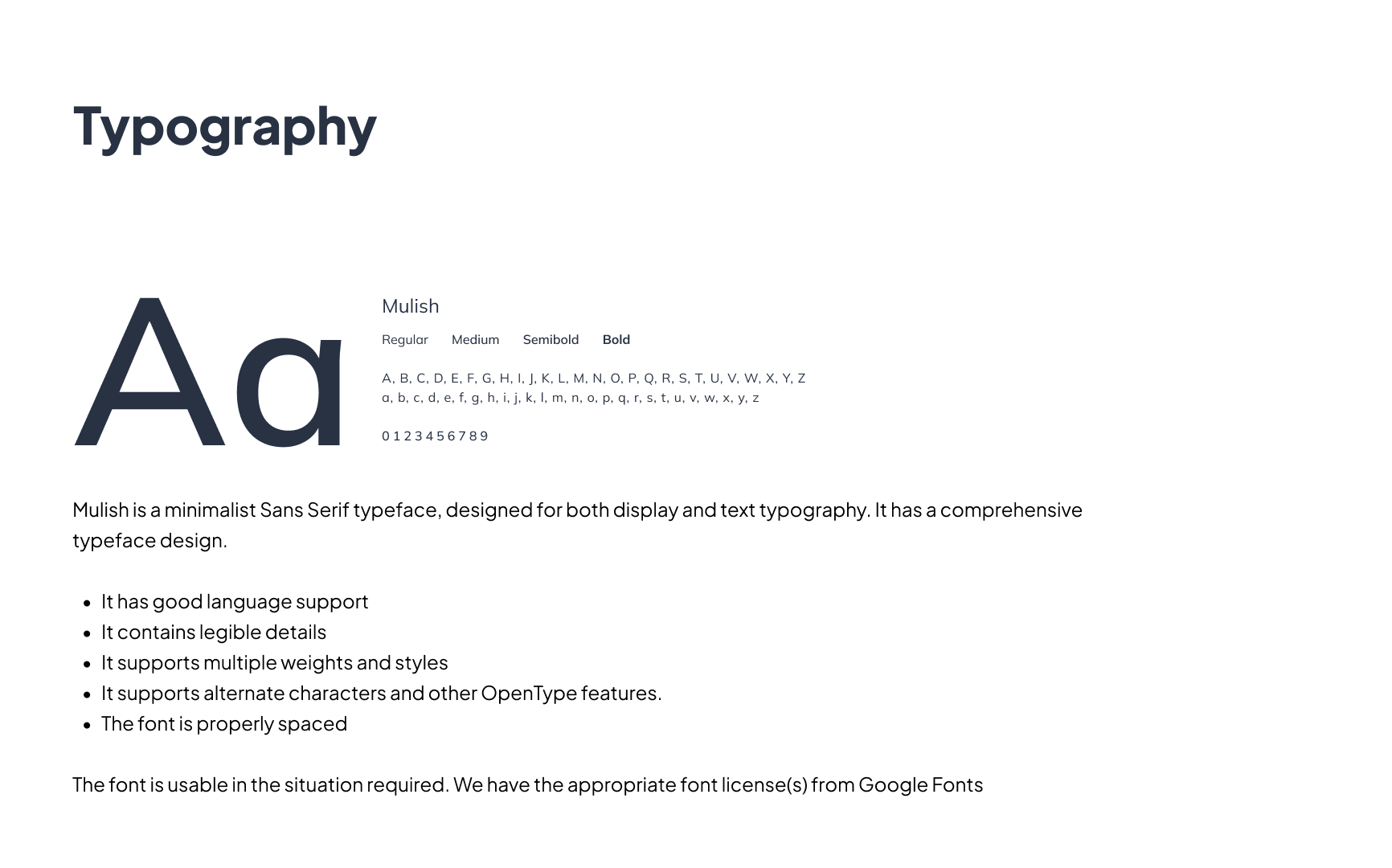
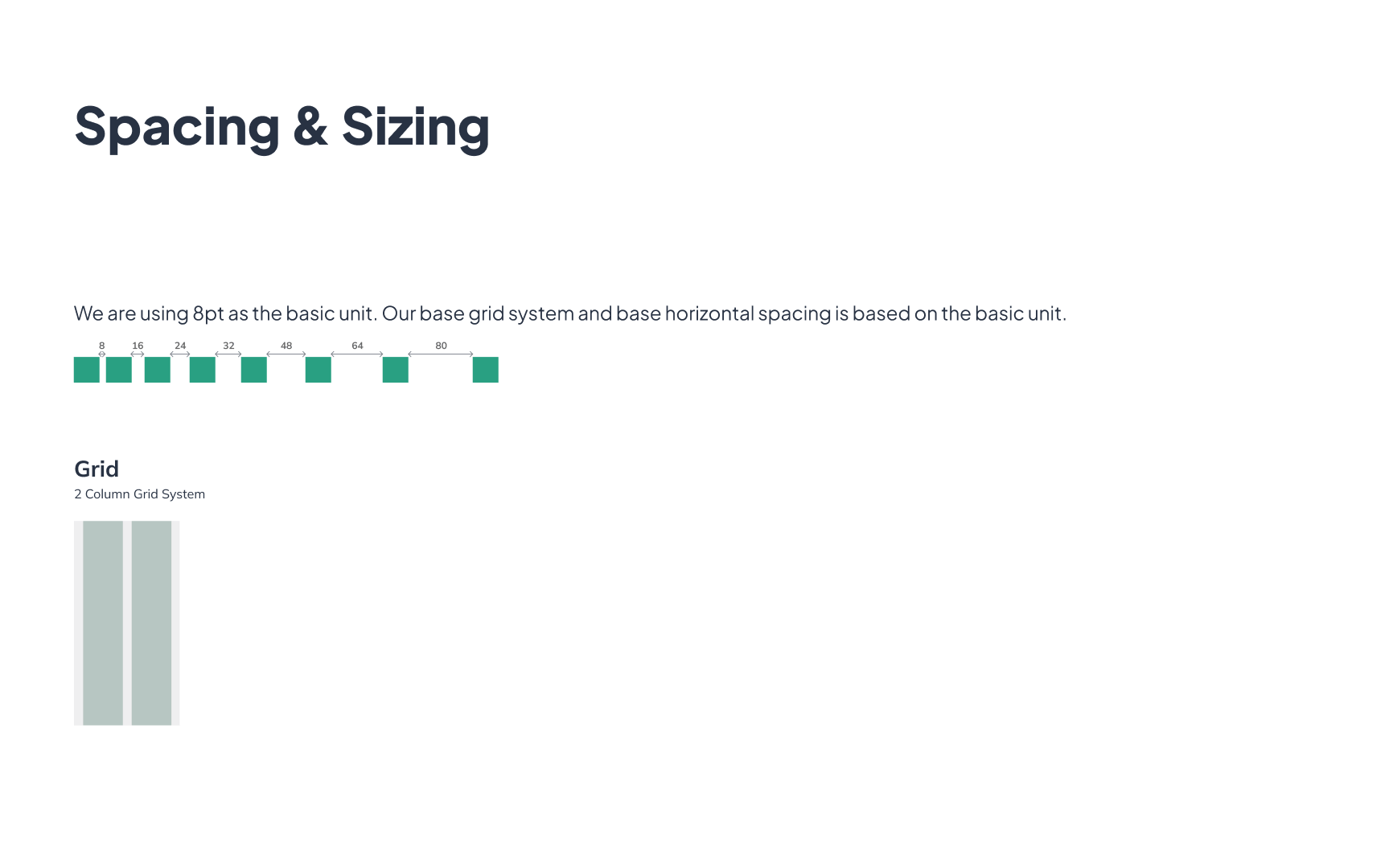
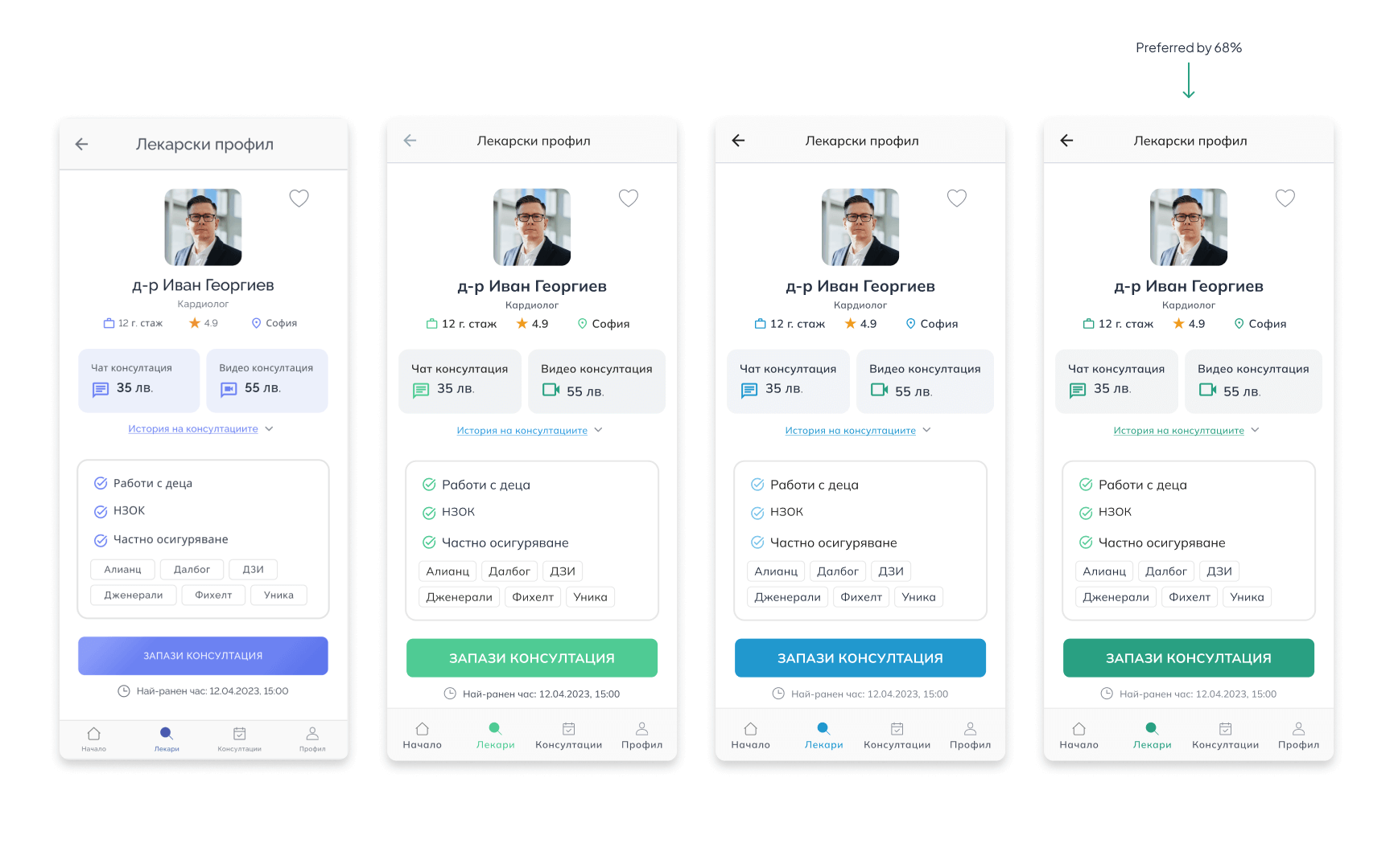
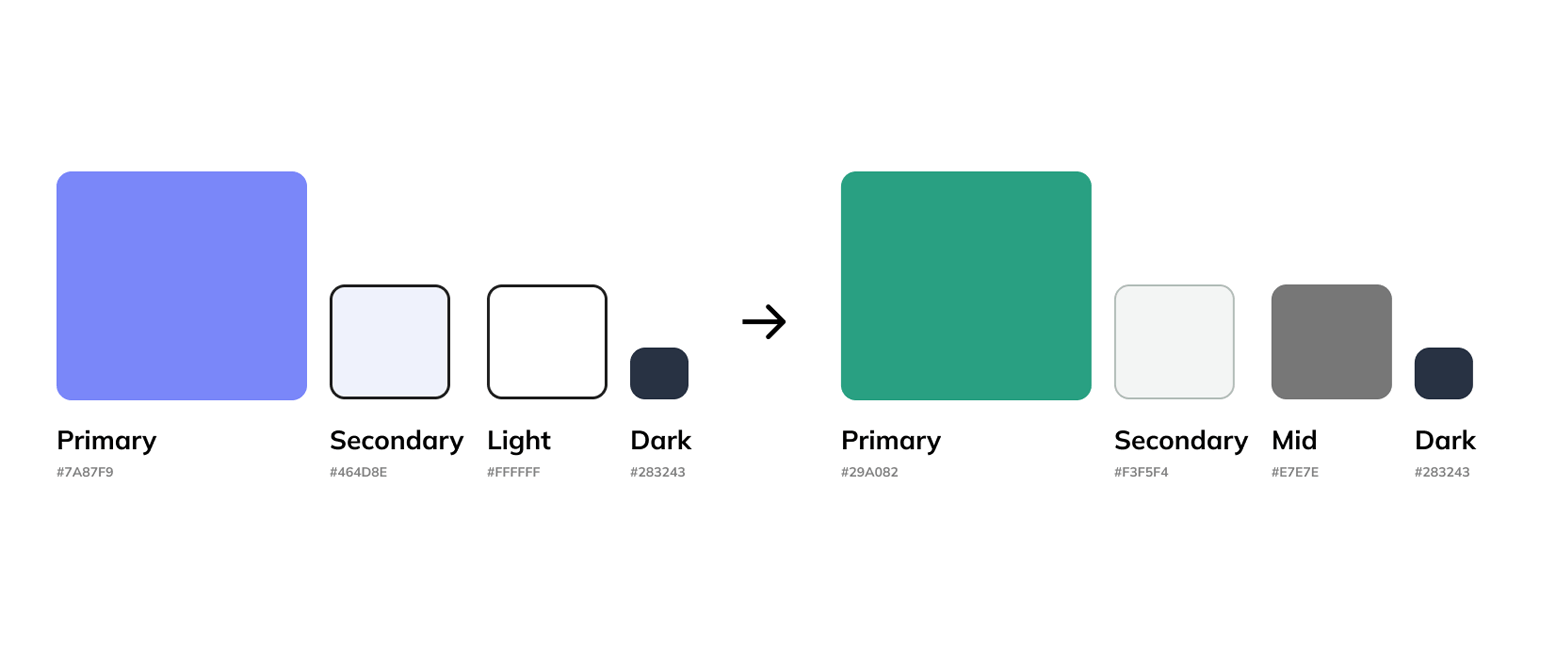
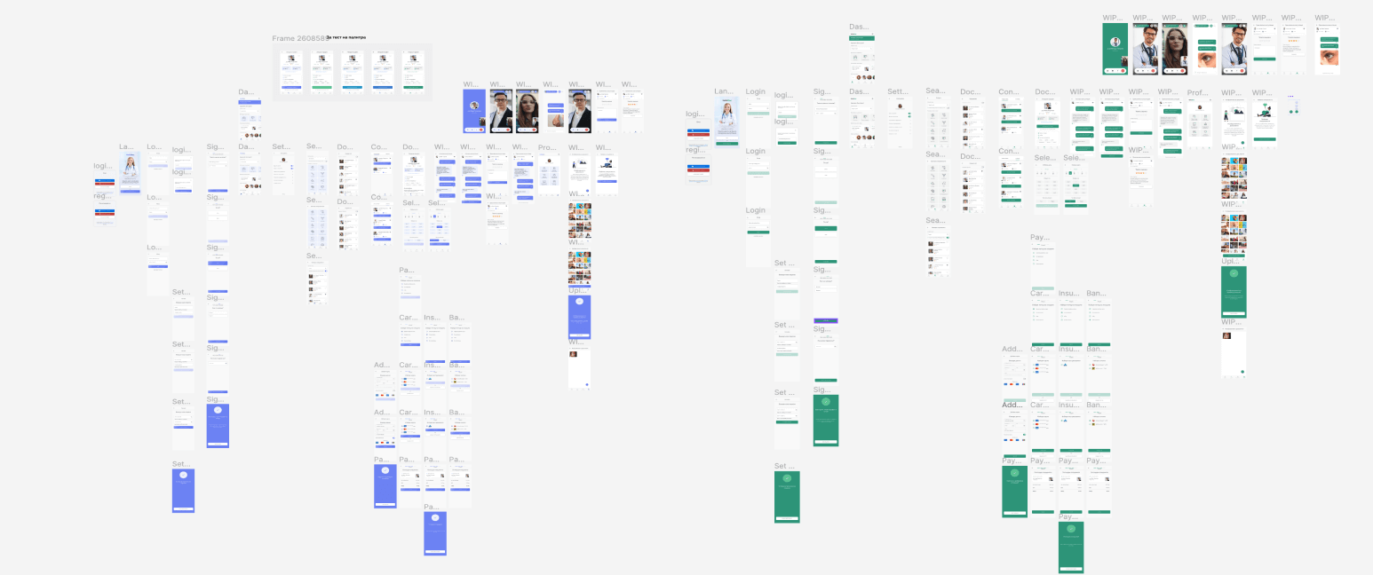
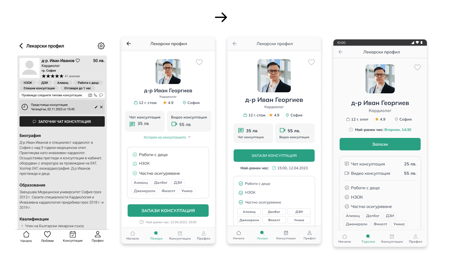
After the wireframes were tested thoroughly, we worked on the high fidelity prototypes. First, we started with laying the groundwork by choosing the typography, color scheme and the general visual feeling of the platform. Subsequently, many iterations and user tests were performed in order to achieve the final result.
Visual Identity
Visual identity • Click to open gallery
In conclusion
This was my first UI/UX project that I worked on following the best practices. Even though my previous experience includes some UI/UX work, until now I haven't had the chance to properly complete such a project. A key takeaway for me was the increased focus on user testing and how many insights me and the team managed to get out of it.
Check out the high fidelity prototype
Figma LinkResume
Get in touch
